The Chet Roses
These photographs grew out of my work around Chet Baker’s “My Funny Valentine” for An Atlas of Favourite Songs.
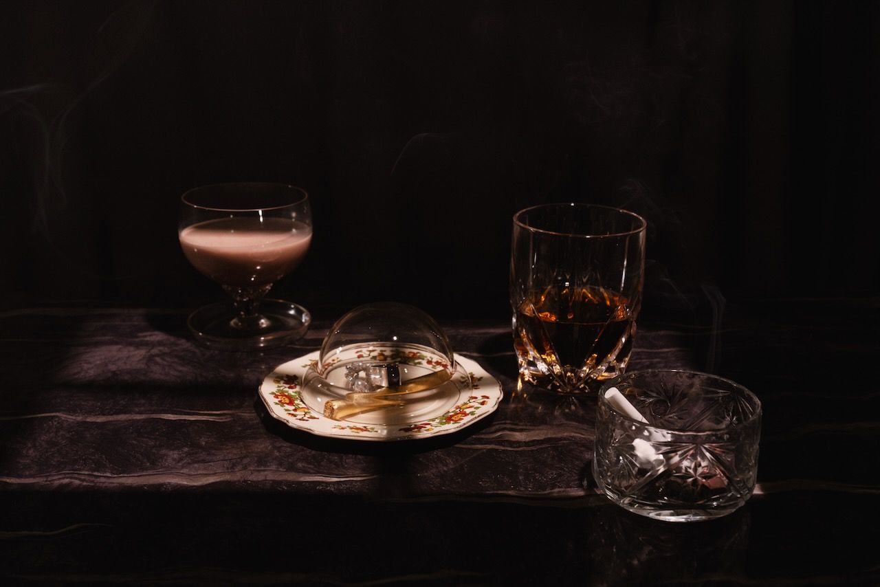
The original Chet setup was built around a very specific mood: deep red roses in a round crystal decanter, photographed with my Sony A7R III and Zeiss 85mm, with a Black Mist 1/8 filter as part of the look. I lit the flowers with a Godox AD200Pro through an 80 cm octa, while a Godox SK400 II with an optical snoot and window gobo created the shaped background light. The background projection was deliberately kept darker than the subject so the flowers and glass carried the visual weight.
The photographs here are a much tighter, more abstract extension of that idea.
Rather than treating the rose simply as a flower, I wanted to get close enough that it became shape, texture, light and colour.
At that distance, the rose stops behaving visually like a familiar object. The folds of the petals become their own landscape. Edges overlap. Highlights collect along thin surfaces. Darker folds disappear into one another. What matters is no longer simply “a rose”, but the structure inside it.
That was what interested me.
The light
The strongest characteristic of these images is the way the light moves through the flower.
The rose is not simply being lit from the front and recorded as a surface. Light is passing through the thinner parts of the petals, which is why some areas appear almost translucent while others hold much more shadow and density.
That difference gives the flower its depth.
The thinner edges glow. The thicker folds remain solid. The centre builds up into layer after layer of overlapping form.
Against the black background, there is almost nothing else competing with it.
The flower becomes the entire photograph.
Getting close
Working this close changes the visual language completely.
Depth of field becomes extremely shallow, so the eye starts moving through individual planes of the flower rather than reading the whole rose at once.
The overlapping petals are what create that slightly unreal quality in the centre of the images. That is not a registration error or a broken stack. It is the actual structure of the flower being revealed at very close range, combined with the way the light is travelling through those overlapping layers.
The result is still recognisably a rose, but only just.
That line between recognisable and abstract is exactly where I wanted these photographs to sit.
The editing
The editing was built around preserving that structure rather than flattening it.
I worked the tonal range so the blacks stayed very deep while the illuminated parts of the flower retained detail. The petals needed enough separation from one another that the folds remained readable, but I did not want the image to start looking hard or overprocessed.
A lot of the work was therefore about tone, luminosity and colour relationships rather than simply increasing global contrast.
Curves and tonal adjustments were used to control where the flower opened up and where it disappeared back into shadow.
Colour work then became a major part of the final interpretation.
The underlying rose remained the same, but changing the colour world changed the emotional character of the photograph completely.
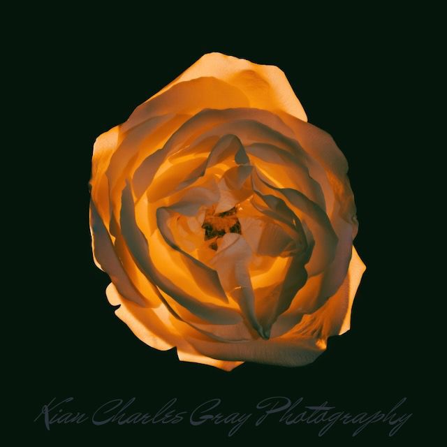
Gold
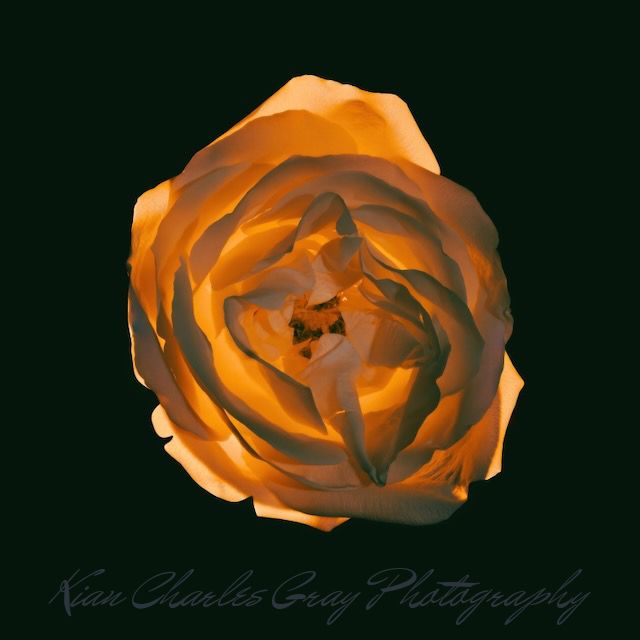
The gold version pushes the illuminated areas toward amber, orange and warm metallic tones.
It feels almost heated.
The outside petals retain enough neutrality that the warmer light appears to be coming from within rather than simply sitting over the image.
That was important.
I wanted the colour to feel connected to the physical light in the flower, not like a colour filter dropped on top afterwards.
The result sits somewhere between a flower, flame and metal.
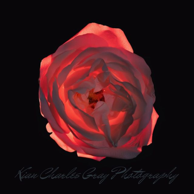
Red
The red version is obviously the most closely connected to My Funny Valentine.
But I did not want it to become a sentimental Valentine's rose.
The deeper reds are much more intense than that.
They push the image toward something physical and almost bodily. The darker areas give the colour weight, while the illuminated folds keep enough variation that the red never becomes flat.
That tension between beauty and something slightly darker feels much closer to the mood I associate with Chet Baker.
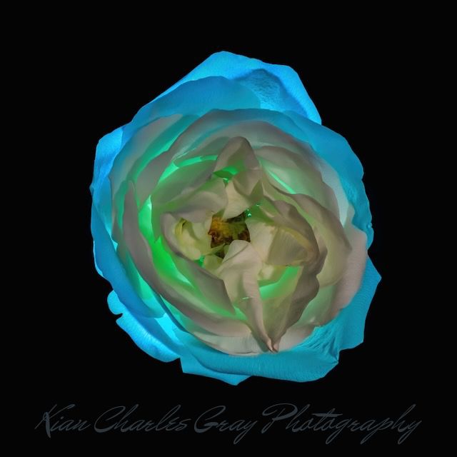
Blue and Lime
The blue-and-lime version deliberately breaks the visual expectation of what a rose should look like.
Once those familiar red, pink or white associations disappear, the structure of the flower becomes much more obvious.
The blue establishes the outside architecture of the petals while the greenish light deeper inside gives the centre a completely different energy.
This is probably the most abstract of the group.
It begins to look less botanical and more like glass, water, coral or some invented organic structure.
That ambiguity is part of what makes it work for me.
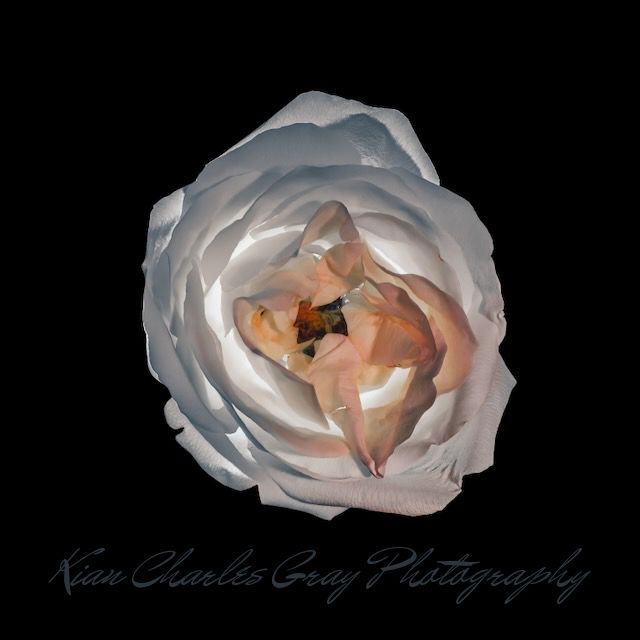
Porcelain
The porcelain version goes in almost the opposite direction.
Most of the colour is held back.
That allows the whites, greys and very subtle warm tones inside the flower to carry the image instead.
Without strong colour dominating the frame, the texture becomes much more obvious.
The rose starts to feel carved rather than grown.
Porcelain, fabric, paper, bone — it moves between all of those associations without becoming any one of them.
One flower, four different photographs
What interested me most after working through these was how dramatically the same physical subject changed once the colour relationships changed.
The gold version feels warm and luminous.
The red version feels more intense and emotional.
The blue and lime version feels unfamiliar and almost alien.
The porcelain version becomes quieter and much more sculptural.
The flower itself has not changed.
The interpretation has.
That is one of the things I enjoy most about photography: the photograph is not simply what was in front of the camera.
It is also what you choose to emphasise, suppress, colour, darken, reveal and leave unresolved.
These four photographs began with the same rose.
They did not end in the same place.
Kian Charles Gray Photography
Vancouver, Canada